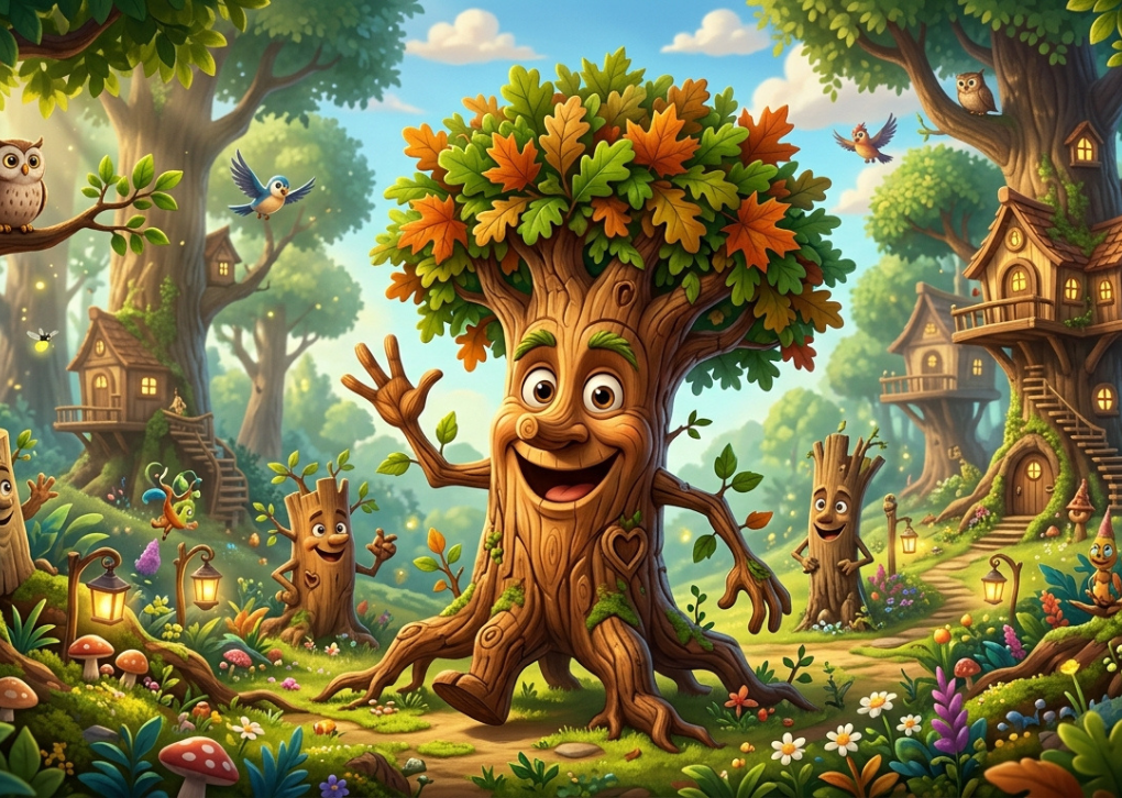
Caricatronchi is increasingly used online to describe a bold form of digital illustration that combines caricature-style exaggeration with cartoon character design, polished coloring, and the flexibility of modern drawing software. The appeal is easy to understand: instead of copying a face literally, the artist decides which features carry the subject’s identity and then amplifies them until the portrait feels more expressive, humorous, or memorable.
There is an important caveat, however. The word is not an established art-history category with a settled academic definition. Recent websites use it as an art label, while established Italian usage also applies caricatronchi to log-loading equipment in forestry. That makes context essential—and it also gives creators an opportunity to define the artistic usage with more precision instead of repeating unsupported origin stories.
What Is Caricatronchi in Digital Art?
In the digital-art context, Caricatronchi can be understood as an emerging internet label for stylized caricature illustration: recognizable subjects are intentionally distorted, simplified, or exaggerated, then rendered with contemporary digital techniques. Oversized heads, compressed bodies, amplified smiles, angular jaws, large glasses, dramatic hairstyles, and highly readable expressions are common visual choices.
The key is not random distortion. Strong work preserves identity while changing proportion. A viewer should still recognize the subject because the artist has protected a few high-information features—perhaps the eyebrow angle, hair silhouette, spacing of the eyes, posture, or characteristic smile—even when the rest of the anatomy becomes playful.
That principle comes directly from the much older logic of caricature. The Metropolitan Museum of Art describes caricature as a practice that distorts physical characteristics and traces the word to Italian carico and caricare, associated with loading or exaggerating a subject. The museum also notes that the form took recognizable shape in Europe through Renaissance experiments and later became a major vehicle for social and political satire.
A Crucial Clarification About the Name
A surprising amount of online content presents Caricatronchi as if it were a centuries-old named movement or a clearly documented Italian school. The evidence does not support that claim. The linked AfterBreakMag article, published in December 2025, presents the word as a fusion of caricature and digital cartooning, but it does not establish an academic lineage for the term itself.
There is also a documented non-art meaning. Italian forestry and machinery sources use caricatronchi for equipment that loads or handles logs; Volvo, for example, describes an L350H “versione caricatronchi,” and Wood-Mizer uses the same word for loading arms that lift heavy logs onto a sawmill bed.
For an art-focused reader, the practical takeaway is simple: treat Caricatronchi as a newer online creative label, not a historically standardized movement. That framing is both more accurate and more useful because it lets us discuss the actual visual language without inventing a false provenance.
The Visual Language That Makes the Style Work
The style succeeds when exaggeration is selective. If every feature is enlarged equally, the result becomes noisy and recognition drops. If only one or two distinctive traits are pushed while the rest of the design supports them, the portrait becomes immediately readable.
Think in terms of visual hierarchy. The largest shape should communicate the first impression; secondary shapes reinforce personality; small details reward closer viewing. That is why head-to-body ratio, hair mass, nose shape, eye spacing, shoulder width, and pose matter more than tiny skin textures at the sketch stage.
A useful design test is to reduce the portrait to a black silhouette. If the character still feels distinctive, the structural design is doing real work. If it becomes generic, adding more rendering will not solve the underlying problem.
Exaggeration Without Losing Likeness
The strongest Caricatronchi portraits usually preserve relationships rather than measurements. A nose can become twice as large, for example, while still keeping its original tilt relative to the mouth; eyes can grow dramatically while retaining their characteristic spacing and lid shape.
This is where observation beats decoration. Before drawing, identify three identity anchors: one facial feature, one silhouette feature, and one behavioral cue. Those anchors give the illustration a recognizable core even when proportions become extreme.
Expression Is More Valuable Than Detail
A technically polished drawing can still feel lifeless if the expression is neutral. Eyebrows, eyelids, cheeks, mouth corners, head tilt, and shoulder position carry emotion quickly, especially on small screens where fine detail disappears.
For portraits designed for avatars, stickers, thumbnails, or social posts, test the face at a small viewing size before finishing. If the emotion is unclear at thumbnail scale, simplify the expression and increase the contrast between major shapes.
From Traditional Caricature to a Digital Workflow
The underlying idea is old; the workflow is new. Nineteenth-century caricaturists such as Honoré Daumier used lithography to distribute recognizable exaggerations and satire to mass audiences. The Met’s collection documents Daumier’s use of enlarged heads, compressed bodies, and politically charged distortion long before tablets or illustration apps existed.
Digital tools change what happens after the observation stage. Instead of committing immediately to ink, paint, or lithographic stone, an artist can reshape a jaw, move an eye, recolor a jacket, test five backgrounds, or reduce an oversized head without redrawing the entire image.
That reversibility matters. It encourages more experimentation, but it can also tempt artists into endless tweaking. A disciplined digital caricature workflow therefore uses digital flexibility to explore early, then deliberately locks decisions as the image becomes more resolved.
Raster vs. Vector: Which Is Better?
There is no single correct file type. Raster artwork is pixel-based and is especially effective for painterly shading, textured brushes, subtle color transitions, and hand-drawn surfaces. Adobe notes that raster images can represent continuous-tone detail well but are resolution-dependent and can lose quality when enlarged.
Vector artwork uses mathematically defined paths and shapes, so it can scale cleanly to very large sizes. That makes vector especially useful when a stylized character needs to appear on logos, signage, apparel, packaging, stickers, or other outputs that may change size repeatedly.
Many professional workflows combine both. The artist may sketch and paint in a raster app, then rebuild key outlines or typography as vectors for production-ready assets.
A Practical Caricatronchi Creation Process
A repeatable process is more valuable than chasing a particular brush pack. Use this sequence to move from reference to finished illustration while keeping the character recognizable:
- Study before sketching. Note the subject’s dominant shapes, facial asymmetries, hairstyle, accessories, posture, and habitual expression.
- Choose three identity anchors. Protect one facial trait, one silhouette trait, and one behavioral or emotional cue throughout every revision.
- Push proportions in thumbnails. Create several tiny sketches with different head sizes, jaw widths, eye scales, or body shapes before committing to a full drawing.
- Build clean structural layers. Separate sketch, line art, flat colors, shadows, highlights, texture, and background so edits remain controlled.
- Use value before color. Make sure the face, hair, clothing, and background read clearly in grayscale; color cannot rescue weak value separation.
- Add texture last. Brush grain, paper effects, glow, and painterly noise should reinforce form rather than conceal uncertain drawing.
- Test multiple output sizes. Check the final piece as a full-resolution portrait, a mobile-screen post, and a small avatar or sticker.
Layer-based drawing is especially useful here because major elements remain independently editable. Procreate’s documentation, for example, describes layers as a way to overlap, move, recolor, mask, and delete elements without altering the rest of the artwork.
What Tools Do Artists Actually Need?
You do not need an expensive studio. A pressure-sensitive stylus and an app that supports layers, masks, selections, transform tools, and custom brushes are enough to build a serious workflow. Software choice should follow the intended finish rather than popularity alone.
For painterly work, raster-first tools make it easy to combine sketching, inking, smudging, and textured color. Procreate’s brush library, for instance, includes dedicated sketching, inking, painting, and texture-oriented brush sets, while layer masks and clipping masks support non-destructive editing.
For crisp linework, scalable shapes, and commercial graphics, vector-oriented software is often a better fit. The deciding question is not “Which app is best?” but “Will this image need painterly nuance, infinite scalability, animation-ready separation, print production, or all four?”
Caricatronchi vs. Caricature, Cartoon Art, and Avatars
Traditional caricature is primarily defined by exaggerating recognizable features. Cartoon art is broader: it may depict entirely fictional characters and can prioritize simplification, sequential storytelling, visual comedy, or animation-friendly design instead of resemblance.
Caricatronchi sits comfortably between those territories when the term is used artistically. It borrows likeness and selective distortion from caricature, shape economy and expressive posing from cartoon design, and digital polish and reproducibility from contemporary illustration workflows.
A generic avatar, by contrast, may simply convert a photo into a simplified icon. A stronger stylized portrait interprets the subject. It asks what should be amplified, what should be removed, and what visual cue makes the person unmistakable in one second.
Where This Style Is Most Useful
The style works particularly well when personality must survive at small sizes. Social profile images, creator branding, podcast artwork, editorial portraits, event graphics, stickers, custom gifts, streaming overlays, and mascot-like personal brands all benefit from an instantly readable face and a distinctive silhouette.
Commercially, consistency matters more than isolated novelty. If a brand wants a family of Caricatronchi characters, define a small style system: outline weight, eye construction, head-to-body ratio, shadow hardness, palette logic, and background treatment. Those rules make separate commissions feel like one visual universe.
The same principle applies to content creators. Reusing a recognizable illustrated persona across thumbnails, reaction graphics, banners, and merchandise can create continuity without requiring the exact same pose each time.
AI-Assisted Creation: Useful Tool, Weak Substitute for Art Direction
Generative AI can help with ideation, pose exploration, palette options, or rough composition, but it does not remove the need for authorship decisions. The hardest part of Caricatronchi is not producing an exaggerated face; it is deciding which exaggeration communicates identity, humor, or narrative intent.
There are also legal and ethical questions. In the United States, the Copyright Office stated in its 2025 report that AI-assisted work can still contain protectable human authorship, but purely AI-generated material is protected only where sufficient human-authored expressive elements are present; prompting alone does not automatically establish authorship.
For client work, keep a clear process record. Save sketches, intermediate layers, edits, and source references; obtain permission for private reference photos; and avoid deliberately mimicking a living artist’s recognizable style when the client could reasonably confuse imitation with original authorship.
Common Mistakes That Make the Artwork Feel Generic
The most common error is exaggerating stereotypes instead of observed features. Big eyes, giant heads, and tiny bodies are not automatically expressive; if they are applied identically to every subject, the result becomes a template.
Another mistake is rendering too early. Artists sometimes spend an hour painting pores, hair strands, and fabric before deciding whether the underlying head shape is interesting. Fix the silhouette, proportions, expression, and value structure first.
Finally, avoid using effects as a substitute for design. Neon rim lights, glossy highlights, grain, and elaborate backgrounds can enhance Caricatronchi, but only after the character works in simple line and flat color.
How to Develop a Recognizable Personal Style
Style emerges from repeated decisions, not from downloading a signature brush. Study how you naturally simplify noses, eyes, hands, folds, and hair; notice which proportions you return to; then codify those tendencies rather than constantly copying surface effects from other artists.
Create a small internal style sheet for your own Caricatronchi work. Include two or three head constructions, a line-weight rule, preferred shadow shapes, a limited palette strategy, and examples of expressions at different intensity levels. This turns instinct into a repeatable system while leaving room for each subject to remain individual.
FAQ About Caricatronchi
Is Caricatronchi a real art movement?
It is better described as an emerging online label than a formally recognized art movement. The term appears on recent websites discussing digital caricature and cartoon-style illustration, but authoritative art-history sources do not establish it as a historical school. Its underlying methods, however—exaggeration, likeness, satire, simplification, and character design—are well established.
What does Caricatronchi mean?
In current art-focused web usage, Caricatronchi generally refers to exaggerated, cartoon-like digital portraits or characters. Separately, the Italian word is also used in forestry for log-loading machinery, which is why search results may appear inconsistent.
Can beginners learn this style without strong portrait skills?
Yes, but observational drawing still matters. Beginners can start with simple shape analysis—head silhouette, eye spacing, nose direction, hairstyle, and expression—then exaggerate one feature at a time. Studying likeness will make stylization more convincing because you are intentionally breaking proportions rather than guessing them.
Is Procreate good for Caricatronchi artwork?
Yes. Its brush, layer, mask, transform, and color tools support a fast raster illustration workflow, and its documentation specifically highlights editable layers and broad brush categories for sketching, inking, painting, and texture. Other raster or vector programs can work equally well if they support the workflow you need.
Can AI generate Caricatronchi portraits?
AI tools can generate exaggerated cartoon-like portraits, but a strong result still benefits from human art direction, editing, and a clear visual system. For commercial work, also consider consent, reference-image rights, platform terms, and jurisdiction-specific copyright rules rather than assuming every generated output has the same legal status.
Final Takeaway: Build the Style Around Observation, Not Hype
Caricatronchi is most useful when treated as a practical contemporary label for expressive digital caricature—not as a mysterious historical movement that needs an invented origin story. Its real creative strength comes from a proven idea: exaggerate the features that carry identity, simplify what does not matter, and use digital tools to iterate without losing the human decisions behind the image.
If you want to create your first piece, start with one clear reference photo and three identity anchors. Produce five tiny proportion studies, choose the version with the strongest silhouette, build it in clean layers, and test the finished image at avatar size. That process will teach you more about effective Caricatronchi than any preset, filter, or one-click effect ever will.



3 Comments on “Caricatronchi: The Complete Guide to the Emerging Digital Caricature Style”