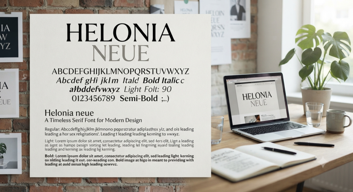
Helonia Neue is often presented online as a fashionable modern typeface built for branding, websites, editorial layouts and user interfaces. That description is attractive, but it skips the most important part: reliable documentation for the font is unusually thin, and many recent pages repeat claims that cannot be traced to an official specimen, active foundry or current licence.
The surviving evidence points in a different direction. Rather than being a newly released design sensation, the name appears in older software directories as a Rubicon Computer Labs shareware font, distributed in TrueType and PostScript Type 1 formats and described as a Helvetica Neue clone with matching metrics, kerning pairs and a full character set.
That distinction matters. A designer choosing a typeface needs more than a pleasing screenshot. You need to know who created the files, what usage rights apply, whether the family contains the characters and weights your project requires, and whether the font can be embedded legally in websites, apps, PDFs or client deliverables.
What Is Helonia Neue?
The best-supported explanation is that Helonia Neue was a legacy desktop-publishing font associated with Rubicon Computer Labs. An archived listing identifies version 1.31, calls it a sans-serif clone of Helvetica Neue, and states that it was sold as shareware for $12 rather than distributed as unrestricted freeware.
The listing also advertises matching font metrics, a full character set, kerning pairs and hinting intended for output devices up to 3,500 dpi. Those are historically plausible selling points for a desktop font designed to preserve document layout and render cleanly on older printers and screens.
Yet there is a naming complication. Type historian Luc Devroye’s directory connects Rubicon Computer Labs and designer Lee-Jeff Bell with many fonts modeled on established type families, but it lists Hilbert Neue, not Helonia Neue, as Rubicon’s Helvetica Neue-style design.
That leaves several possibilities:
- The family may have been renamed in a later catalogue.
- A distributor may have recorded the product name incorrectly.
- Multiple related Rubicon releases may have circulated under similar names.
- The error may have been copied across software directories over time.
There is not enough primary documentation to settle the naming issue conclusively. The sensible position is therefore cautious: the name is historically attested, but any actual font file should be verified through its internal metadata and accompanying licence before use.
Why Helonia Neue Is So Confusing Online
Search results make Helonia Neue look more established than the evidence supports. Numerous articles describe it as a contemporary geometric-humanist family with broad language coverage, multiple weights, advanced OpenType features and growing popularity among designers.
The problem is not that every aesthetic description must be false. The problem is that many pages provide no designer name, release date, foundry specimen, glyph chart, official licence, version history or downloadable source that would allow those claims to be checked.
Some pages even contradict one another. One calls the design a sans serif; another describes it as an elegant serif. Others attribute it to a modern independent foundry without linking to a product page, while older directories identify it as Rubicon shareware.
For readers and search engines, the information-gain opportunity is clear: separate verified facts, reasonable inferences and unsupported marketing language.
What Can Be Verified
The available records support a narrow set of claims:
- The name appeared in historical software catalogues.
- Rubicon was associated with the product.
- Version 1.31 was listed in TrueType and PostScript Type 1 formats.
- It was described as metrically compatible with Helvetica Neue.
- The listed licence model was shareware, not public domain.
- Rubicon produced several typefaces modeled on famous historical families.
What Remains Unverified
Claims about variable-font technology, extensive OpenType alternates, contemporary UI optimization, multilingual coverage, current ownership or a live commercial licence should not be treated as facts unless they are confirmed in the actual files or by the rights holder.
This is where many competing articles fall short. They describe an impressive product but provide no evidence that the features belong to the original typeface.
The Likely Design Character of Helonia Neue
If a file genuinely matches the archived description, Helonia Neue probably belongs to the neo-grotesque sans-serif tradition. That means restrained forms, relatively neutral proportions, low decorative contrast and a disciplined texture suited to information-heavy communication.
This is an inference from its documented comparison with Helvetica Neue, not a substitute for examining an authentic specimen. Monotype notes that Neue Helvetica was redesigned and digitized by D. Stempel AG in 1983 as a coordinated family, eventually expanding to 51 weights.
A genuine Rubicon-compatible version would most likely have been intended to produce similar line lengths and page breaks. Metric compatibility is especially useful when opening legacy documents because substituted text may remain close to the original pagination.
It does not guarantee identical drawing quality, spacing, kerning, hinting, language support or visual tone. Two fonts can occupy similar widths while still looking noticeably different in curved letters, punctuation, numerals and bold weights.
Characteristics You Might Expect
A genuine version may exhibit:
- A neutral, corporate visual tone.
- Compact and orderly proportions.
- Relatively uniform stroke weight.
- Minimal decorative detailing.
- Efficient use of horizontal space.
- Strong suitability for structured information.
- Letter widths designed to approximate Helvetica Neue.
These characteristics should be treated as a testing hypothesis. The authentic font file remains the final source of truth.
Helonia Neue vs. Helvetica Neue
The relationship between Helonia Neue and Helvetica Neue is best understood through compatibility, not equivalence. The archived product description explicitly uses the word “clone,” but that historical catalogue language should not be interpreted as proof that every outline or feature is identical.
Helvetica Neue has a documented lineage, an active licensing ecosystem and a coordinated professional family. Its official history, family structure and ownership are substantially easier to verify.
A legacy Rubicon alternative may still have practical value when:
- Restoring an old document created with that exact font.
- Investigating historical desktop-publishing workflows.
- Preserving approximate pagination in archived files.
- Comparing metric-compatible typeface substitutes.
- Reproducing an older brand asset under a valid licence.
For a new website, app or multinational brand system, the uncertainty becomes a disadvantage. Long-term projects need dependable licensing, current file formats, technical support, broad glyph coverage and predictable access for every collaborator.
Metric Compatibility Does Not Mean Visual Identity
A metrically compatible font attempts to occupy similar horizontal and vertical space. This can help prevent headings from wrapping onto another line or paragraphs from moving onto an extra page.
However, metric compatibility does not automatically reproduce:
- Exact letter shapes.
- Optical corrections.
- Kerning quality.
- Italic construction.
- Punctuation placement.
- Numeral styles.
- Language coverage.
- Screen-rendering behavior.
That is why side-by-side proofing is essential. A replacement may preserve the document’s dimensions while changing its personality.
How to Verify an Authentic Helonia Neue Font File
Do not rely on the filename alone. A file called HeloniaNeue.ttf can be renamed by anyone, while the internal naming tables may reveal a different family, manufacturer or copyright statement.
Use this verification workflow before installing or sharing the file.
1. Inspect the Metadata
Open the font’s properties or use a reputable font-inspection tool. Record the family name, subfamily, version, manufacturer, designer, copyright line, trademark notice and embedding permissions.
Windows exposes designer and manufacturer information through its font settings, and Microsoft recommends checking font properties to identify the owner or developer.
Look closely at these metadata fields:
- Family name
- Full font name
- PostScript name
- Version string
- Manufacturer
- Designer
- Copyright notice
- Licence description
- Vendor ID
- Embedding permissions
One matching field is not enough. The complete metadata profile should make historical and technical sense.
2. Compare the Version Number
The surviving catalogue references version 1.31. A different version is not automatically fake, but it requires additional evidence.
Look for a matching readme file, purchase record, archive description or vendor documentation. A version number without provenance is only a clue.
3. Check Glyph Coverage
Create a specimen containing uppercase and lowercase letters, numerals, punctuation, currency symbols, accented Latin characters and any languages required by the project.
Test real copy, not only “The quick brown fox.” Brand names, prices, dates, legal symbols and customer names expose missing characters much faster.
A useful specimen should include:
- À Á Â Ä Ç È É Ê Ë
- Ñ Ö Ø Š Ü Ž
- à á â ä ç è é ê ë
- ñ ö ø š ü ž
- € £ ¥ $ ¢
- © ® ™
- 0 1 2 3 4 5 6 7 8 9
- “ ” ‘ ’ — – … % & @
Legacy fonts may contain fewer international characters than a current professional family. Never assume that “full character set” means modern global coverage.
4. Examine Spacing and Kerning
Test combinations such as AV, VA, To, Ta, Yo, WA, LT, 11, 00 and punctuation beside capitals. Poor kerning becomes obvious in logos, headings and packaging even when body text appears acceptable.
Also compare line wrapping against a legitimately licensed Helvetica Neue file if metric compatibility is central to the project.
Check the font at several sizes:
- 9–12 px for interface text.
- 10–14 pt for print body copy.
- 18–32 pt for subheadings.
- 48 pt and above for display typography.
Problems hidden at one size may become obvious at another.
5. Scan the File
Old font packages may come from abandoned download portals, mirrors or compressed archives. Scan them with current security software and avoid installers that request unnecessary permissions.
A raw font file is generally preferable to an unknown executable installer. Keep an untouched backup so that any changes or conversions can be detected later.
6. Test Export and Embedding
Create a temporary document and export it as PDF. Check whether the font embeds successfully, appears as a subset, triggers a warning or is replaced.
Then reopen the PDF on another machine. This reveals whether the output depends on the locally installed font.
Helonia Neue Licensing: The Risk Designers Cannot Ignore
The archived listing labels Helonia Neue as shareware. Shareware usually means the software could be evaluated under specified conditions, while continued or commercial use required payment or registration. It does not mean the file is automatically free for unlimited commercial use.
The original $12 listing is historical evidence of a licence model, not a licence grant for a file downloaded today. Without the accompanying terms or a verifiable rights holder, you cannot safely assume permission for client work, web hosting, app embedding or redistribution.
Font licences often distinguish among:
- Desktop use for creating static artwork.
- Document embedding in PDF or office files.
- Webfont hosting through WOFF or WOFF2.
- Application, game or device embedding.
- Server use and automated document generation.
- Editable templates supplied to customers.
- Broadcasting, social assets and commercial logos.
Microsoft’s font guidance explains why these distinctions matter. Font files contain embedding flags, and “restricted licence” fonts must not be embedded without permission; Microsoft also warns that rights for document embedding do not automatically extend to apps, games, devices or webfont conversion.
The W3C likewise notes that a font used as a downloadable webfont must be used in accordance with its licence. WOFF is a technical container, not a way to create legal permission.
A Practical Licensing Rule
Do not deploy Helonia Neue commercially unless you possess one of the following:
- The original licence that clearly covers the intended use.
- Written permission from the confirmed rights holder.
- A valid purchase record tied to usable licence terms.
- Legal advice supporting your specific use case.
When none of those exists, choose a modern alternative with a transparent licence.
Desktop Use Is Not Web Use
A desktop licence commonly permits the font to be installed on approved computers and used to create static artwork. It does not necessarily allow the raw file to be uploaded to a website.
Web use usually requires a licence covering downloadable font files. Converting a desktop TTF file to WOFF2 does not expand the rights attached to it.
PDF Embedding Is Not App Embedding
Some fonts permit embedding in PDFs so recipients can view or print the document. That permission may still prohibit bundling the same font inside a mobile app, game, software package or electronic device.
Always evaluate the exact distribution method. “Commercial use allowed” is too vague to resolve these separate scenarios.
Best Uses for Helonia Neue Today
The strongest use case is legacy restoration, not trend-driven branding. If an archived brochure, manual or presentation requests the family, installing the verified original may help preserve line breaks and visual rhythm.
It may also be useful in typography research. Designers studying the shareware font market, metric substitution or early digital publishing can learn from the way Rubicon positioned compatible alternatives to famous commercial families.
For experimental personal work, a verified file may be interesting when the licence permits it. Keep the font isolated from commercial asset libraries until ownership and usage rights are clear.
Avoid making it the foundation of a new design system when:
- Multiple agencies must access the files.
- The product will be maintained for years.
- Webfont performance and browser testing matter.
- The brand needs non-Latin scripts.
- Editable templates will be distributed.
- An app, game or device must embed the font.
- Procurement requires documented vendor support.
A beautiful typeface becomes a liability when nobody can prove who may use it.
Readability and Accessibility Considerations
A neutral sans serif can support clear communication, but the name of the typeface does not guarantee readability. Actual performance depends on size, spacing, contrast, line length, weight and the quality of the individual font file.
When testing Helonia Neue, evaluate:
- Whether lowercase letters remain distinguishable.
- Whether similar characters such as
I,land1are clear. - Whether
Oand0can be differentiated. - Whether punctuation remains visible at small sizes.
- Whether bold text becomes too dense.
- Whether light weights disappear on low-quality displays.
- Whether accented characters align correctly.
- Whether users can enlarge the text without layout failure.
For body copy, avoid tightly packed lines. A nominally elegant design can quickly become tiring when tracking is too narrow or line height is insufficient.
Web Performance Considerations
Even with valid web rights, an old desktop font may not be optimized for modern delivery. A complete family containing many separate files can increase page weight and delay text rendering.
Before using it online, examine:
- Number of required font files.
- Available compression formats.
- Character subsetting options.
- Browser rendering consistency.
- Font-display behavior.
- Synthetic bold and italic fallbacks.
- Cumulative layout shift.
- Fallback metric differences.
Do not upload every available weight by default. Most websites need only regular, medium or semibold, and bold.
A well-chosen system-font stack may outperform a poorly documented custom font while preserving speed, stability and accessibility.
Safer Modern Alternatives to Helonia Neue
A replacement should match the project’s functional goal, not merely copy the name. Decide whether you need Swiss neutrality, compact metrics, strong screen readability, open licensing or broad language support.
Potential categories include:
- Licensed Helvetica-family options for projects requiring the documented original lineage.
- Arial-compatible choices when platform availability and predictable fallback matter.
- Inter for interface-heavy products and open-source workflows.
- Roboto for broad digital use and a large family ecosystem.
- Noto Sans when extensive language coverage is a priority.
- IBM Plex Sans for a more distinctive corporate and technical voice.
- Source Sans 3 for flexible editorial and interface typography.
Do not assume any substitute will preserve pagination perfectly. Test the actual document at the intended size, width, line height and tracking.
Choose Alternatives by Purpose
For a software dashboard, prioritize character distinction, compact controls and reliable screen rendering. For packaging, pay closer attention to bold weights, numerals and performance at small printed sizes.
Editorial projects need comfortable paragraph texture and useful italics. A corporate identity may require a wide family, consistent licensing and dependable access across external agencies.
The “closest-looking” option is not always the safest operational choice.
How to Use Helonia Neue Responsibly in a Design Workflow
If a client supplies Helonia Neue, begin with an asset audit rather than immediately installing it. Ask for the source, licence, purchase evidence and any brand guidelines that specify approved usage.
Then create a controlled test:
- Duplicate the project.
- Install the font on a non-production machine.
- Record file hashes and metadata.
- Export a full glyph specimen.
- Compare the layout against reference PDFs.
- Check embedding warnings during PDF export.
- Confirm whether collaborators may legally receive the files.
- Prepare a fallback font before production.
For websites, do not convert a desktop file to WOFF2 merely because a converter is available. Technical conversion and legal authorization are separate questions.
For print, package only the files the licence allows you to share. When uncertain, send a press-ready PDF with permitted embedding or outlined display text rather than distributing raw font files—but remember that outlining does not cure an unlicensed source file.
Document Every Decision
Create a simple font record containing:
- File source.
- Download or purchase date.
- File version.
- Copyright information.
- Licence location.
- Approved use cases.
- Number of permitted users.
- Embedding restrictions.
- Replacement or fallback family.
- Person responsible for approval.
This record protects the project from future confusion when staff, vendors or platforms change.
Common Mistakes to Avoid
The biggest error is treating repeated online claims as proof. Ten articles may all originate from the same unverified description.
Other mistakes include:
- Downloading the first matching ZIP file.
- Assuming shareware means free.
- Ignoring internal font metadata.
- Using a personal-use file for client work.
- Converting desktop fonts into webfonts without permission.
- Sharing raw files with every contractor.
- Assuming metric compatibility means identical design.
- Building an entire brand around an unsupported asset.
- Failing to test accented letters and symbols.
- Trusting an attractive mockup instead of a real specimen.
Good typography management is partly visual judgment and partly asset governance. Both matter.
FAQ About Helonia Neue
Is Helonia Neue a Real Font?
Yes, the name appears in historical software catalogues describing a Rubicon font family in TrueType and PostScript Type 1 formats. However, the surviving documentation is incomplete, and another type-history source lists Hilbert Neue as Rubicon’s Helvetica Neue-style family, so file-level verification remains essential.
Is Helonia Neue Free for Commercial Use?
No reliable evidence establishes unrestricted free commercial use. The archived listing calls it shareware and gives a price, which indicates that it was not presented as public-domain freeware.
Commercial use should depend on the actual licence supplied with the file. A historical product description does not replace a legally usable licence agreement.
Can I Download Helonia Neue Safely?
Only download it from a source that provides verifiable provenance, licence terms and unmodified font files. Avoid unknown executable installers, scan archives before opening them and compare internal metadata with the historical version information.
A download that contains no copyright notice, readme file or licence should be treated cautiously. The absence of restrictions in the download description does not prove unrestricted rights.
Is Helonia Neue the Same as Helvetica Neue?
No. Surviving listings describe it as a clone or metrically compatible alternative, but similar metrics do not establish identical outlines, quality, features, ownership or licensing.
Helvetica Neue has a separately documented history and active commercial licensing path.
What Is the Best Alternative to This Font?
The best choice depends on the task. Use a properly licensed Helvetica-family product when exact brand heritage matters; consider Inter, Roboto, Noto Sans, IBM Plex Sans or Source Sans 3 when transparent modern licensing, digital performance or multilingual coverage is more important.
Always compare spacing and line wrapping before replacing the font in a legacy document.
Conclusion: Treat Helonia Neue as a Legacy Asset, Not a Hype Font
Helonia Neue is a useful case study in why typography research requires more than repeating search-result summaries. The evidence connects the name to an older Rubicon shareware product positioned as a Helvetica Neue-compatible sans serif, while its current ownership, official distribution and complete licence trail remain difficult to verify.
The next step is straightforward. Inspect the actual font file, document its metadata, locate the original licence and test its glyphs, spacing, embedding permissions and output quality.
If those checks fail—or the rights remain unclear—replace it with a well-supported modern family before the project reaches production. That decision protects the design, the client and everyone who will need to maintain the work later.